
Landing-page hero not converting? Align the promise, visual and next step
Clarify what you offer, who it is for and what happens next, then test a product-led hero without overlooking mobile performance or checkout friction.
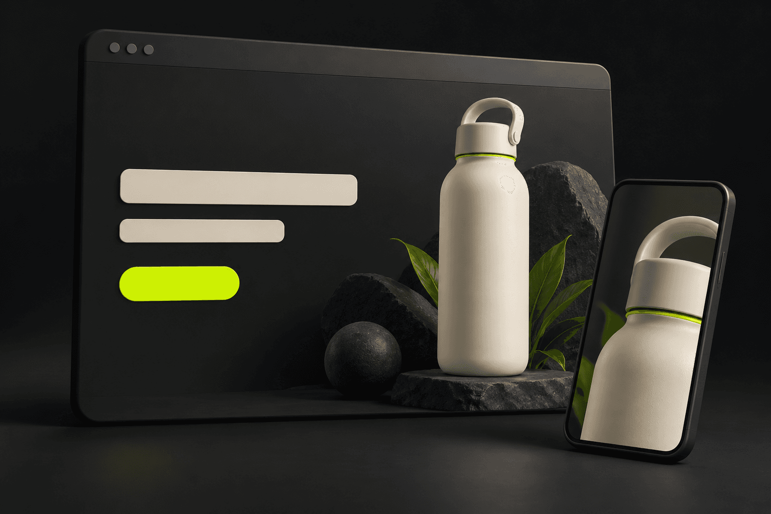
Make the offer understandable before decorating it
A hero can look polished while leaving a visitor unable to explain the offer. Read the first visible heading, supporting line, visual and button together. They should identify what is available, who it is useful for and what the next action does. A vague headline paired with an unrelated cinematic scene may create atmosphere without answering those questions. Diagnose that uncertainty before deciding that you need a more spectacular image.
Write the promise in plain language using facts you can support. For a reusable bottle, an original starting line might be: A compact bottle for your daily bag. The button could say View the bottle, if it opens that product page. Avoid attaching a claimed health, environmental or performance benefit that has not been established. Keep the copy as real website text rather than asking an image model to bake the headline or button into the artwork.
Connect the incoming message with the hero and destination
Open the page from the actual campaign link. Does the product, variant and offer match the message that brought the visitor there? Google Ads recommends alignment between ad content, landing-page information and the call to action, along with straightforward navigation. This is relevant guidance for reviewing the journey; it is not evidence that one layout, colour or button phrase will improve your conversion rate.
Audit where the primary button leads and what happens immediately afterwards. A product hero should not send someone to an unrelated catalogue, unexpected signup or unavailable variant without explanation. Remove competing visual claims and make genuine supporting information easy to find. If delivery costs, pricing or checkout behaviour are the source of hesitation, fix those with the people responsible for the website and offer rather than trying to distract from them with a new background.
Prepare a product-led composition for the real copy
Choose one visual hypothesis: perhaps a recognisable product against a quiet background will explain the offer more clearly than the current abstract scene. Keep the rest of the message stable for this comparison. Decide where the live headline sits and how the image should crop on a phone. A wide hero image is a composition starting point, not a complete mobile layout or an automatically optimised website asset.
An original brief is: Use the approved bottle photograph and preserve its label, cap, colour and proportions. Place the bottle to the right on a simple warm-grey surface. Leave calm space to the left for website text. Do not add slogans, ratings, awards or accessories. In AI Campaign Studio, select a compatible image model and Website hero placement in Product set. Review the credit quote, generate deliberately and inspect the output. Prepare a separate mobile composition if the desktop crop cannot keep the product clear.
Check loading, controls and the actual business action
Test the published page on a phone with realistic network conditions, not just a large design preview. Check readable text, visible controls, image cropping, menu behaviour and whether banners obscure the offer. Web.dev defines Largest Contentful Paint around the largest visible image, text block or video. A hero can therefore be part of the loading diagnosis. Have the website implementation use appropriate image delivery and compression, and compare field observations with lab checks instead of treating one score as the whole experience.
Choose a measurement source, time period and intended action before evaluating the variation. Record other changes and delivery differences, and allow the result to be inconclusive. AI Campaign Studio supplies brand images, videos and controlled asset variations; it does not install tracking, tune bids, set prices, repair checkout or guarantee sales. Publish the reviewed asset through your website tools, retain the original for comparison and decide the next change from observed behaviour rather than the appeal of the new picture alone.
Sources & further reading
- Google Ads: ad alignment, navigation and mobile landing pages ↗
- web.dev: Largest Contentful Paint definition and measurement ↗
Product documentation can change. Check current provider controls and terms before production.